Saturday, 19 December 2015
Friday, 18 December 2015
Thursday, 17 December 2015
Friday, 4 December 2015
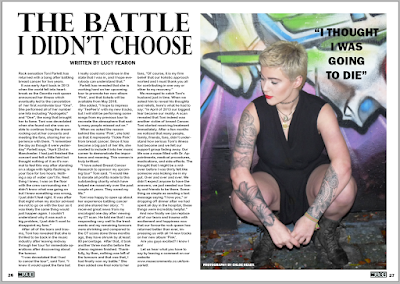
double page article 4
I moved the text 'photography by chloe heads' onto the bottom of the image and shrunk the text size and changed the colour to white to make it stand out. I then centred the text 'written by lucy fearon' because I think it looks better. I have also shrunk the size of the page numbers because they were too big and in magazines I have looked at they tend to be small print. I changed the page numbers from 12 and 13 to 26 and 27. This is because I noticed that in style model magazines the articles tend to be placed further in rather than early on in pages such as 12, as that is where the posters or advertisements are.
double page article 3
I have added page numbers in the bottom corners of the pages. I copied and pasted my muse title which is on both my front cover and contents page so I can represent the magazine. I shrunk the size of it to use it for page numbers.
double page article 2
I have increased the vertical and horizontal scale on the title 'the battle I didn't choose' and added in credits at the top of the article to follow common conventions of a magazine article.
double page article 1
I used this image because I wanted it to look as though she is looking down at the article.
I asked for feedback on my article and there were some good suggestions that I am going to take on board in order to improve my double page spread.
editing the article image
this is the original image that I am using for my double page article. I noticed some marks on her hand which I removed via the spot healing brush tool on Photoshop.
I have also increased the brightness of the image to make her stand out from the dark mise-en-scene and to make the aspects of the image more visible
Subscribe to:
Comments (Atom)


