Saturday, 19 December 2015
Friday, 18 December 2015
Thursday, 17 December 2015
Friday, 4 December 2015
double page article 4
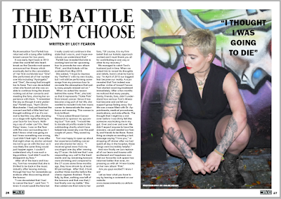
I moved the text 'photography by chloe heads' onto the bottom of the image and shrunk the text size and changed the colour to white to make it stand out. I then centred the text 'written by lucy fearon' because I think it looks better. I have also shrunk the size of the page numbers because they were too big and in magazines I have looked at they tend to be small print. I changed the page numbers from 12 and 13 to 26 and 27. This is because I noticed that in style model magazines the articles tend to be placed further in rather than early on in pages such as 12, as that is where the posters or advertisements are.
double page article 3
I have added page numbers in the bottom corners of the pages. I copied and pasted my muse title which is on both my front cover and contents page so I can represent the magazine. I shrunk the size of it to use it for page numbers.
double page article 2
I have increased the vertical and horizontal scale on the title 'the battle I didn't choose' and added in credits at the top of the article to follow common conventions of a magazine article.
double page article 1
I used this image because I wanted it to look as though she is looking down at the article.
I asked for feedback on my article and there were some good suggestions that I am going to take on board in order to improve my double page spread.
editing the article image
this is the original image that I am using for my double page article. I noticed some marks on her hand which I removed via the spot healing brush tool on Photoshop.
I have also increased the brightness of the image to make her stand out from the dark mise-en-scene and to make the aspects of the image more visible
Friday, 20 November 2015
contents page 2
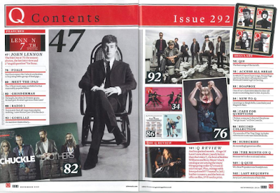
I have replaced the image of my girl band with another section of text (regulars) to fill the page more, as there were already too many images. I have also changed the page numbers to fit the common conventions of a magazine.
Thursday, 19 November 2015
contents page 1
I have added another section to the page (album reviews) because I felt like all of the text down the right hand side of the page was too big. I shrunk the text size for everything which allowed me to create more space for another section and add more text at the top of the page including more artists. I got the idea from my contents page ideas which I wrote down. I got the ideas from looking at similar genre magazines and looking what they include.
Wednesday, 18 November 2015
contents page feedback

this is the layout of my contents page that I have designed. I asked my full media class their opinions of the design and the overall results were good as everyone liked it, however there was a few comments on how I could improve.
After their feedback I am going to take on board their suggestions and make a lot of the text smaller to fit more on, as contents pages usually have a lot more information and text on that I have put in mine.
Tuesday, 17 November 2015
image 3 for contents page
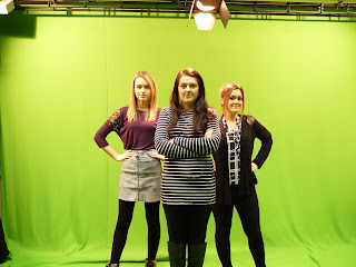
These are the two images that I liked the best. I asked my target audience to choose their favourite image, which was the first one.
I used Photoshop to crop out the green background so it was just a cut out of them. I edited the selective colour and hue saturation which took away the greenness that was on their clothes from the lighting of the green screen. I also used the colour replacement tool to get rid of any remaining green that was on their skin. I then created a new layer which was a plain white background then placed the image of the model on top of the layer.
These are the two images that I liked the best. I asked my target audience to choose their favourite image, which was the first one.
 |
I used Photoshop to crop out the green background so it was just a cut out of them. I edited the selective colour and hue saturation which took away the greenness that was on their clothes from the lighting of the green screen. I also used the colour replacement tool to get rid of any remaining green that was on their skin. I then created a new layer which was a plain white background then placed the image of the model on top of the layer.
when I added it to my magazine, I decided that it didn't fit my genre and therefore didn't include it in my final design,.
image 2 for contents page
I used Photoshop to crop out the green background so it was just a cut out of him. I edited the selective colour and hue saturation which took away the greenness that was on his skin and clothes from the lighting of the green screen. I also used the colour replacement tool to get rid of any remaining green. I then created a new layer which was a plain white background then placed the image of the model on top of the layer.
Sunday, 15 November 2015
Image for contents page
I was lucky enough to capture this image on my phone when I was in the front row of their gig. I have chosen this to be on my contents page because of the clear focus of the image, and it is similar to other band photos that I have saw in my style model magazines.
Concert photos for contents page
I took some photos at a gig a while back and thought they would fit the style of my magazine genre and would look good on the contents page, so I decided to use them.
Tuesday, 10 November 2015
contents page design/layout
This is my flat plan for my music magazine's contents page. I have decided to change my original idea of doing a double page spread as I am now following my style model contents which is only one page. I have decided this because I like the layout of this one more than the double page flat plan that I originally designed as I think it looks better and also will fit in with the style and genre of my magazine well.
Saturday, 7 November 2015
design cover part 12
I have used the spot healing tool to get rid of some marks that were on her chest and also a piercing at the top of her upper lip. I also noticed a small black line on the edge of the white outline around the title 'MUSE' using the brush tool. I selected the layer containing the image of my model and increased the brightness.
Friday, 6 November 2015
design cover part 11
I decided to change the design of the bottom right corner and convert it into a box. I created a new layer and placed a white shape over the text boxes, then also added some more text to fill the box. I increased the horizontal and vertical scale on the word 'plus' to make it fit across the box, and also increased the text size.
Wednesday, 4 November 2015
design cover part 10
I decreased the distance, spread and size on the drop shadow because there was too much black; and I don't think it was necessary to have too much drop shadow on the white text, however it looks much better with a little bit of it.
Tuesday, 3 November 2015
design cover part 9
I added a drop shadow onto white text because it wasn't clear enough on the background and was difficult to read.
design cover part 8
I added the price of the magazine, the date it was issued and the US price. This is printed on the actual barcode in very small text size, as this is where it is in most magazines. I decided to include this on my barcode by placing a white rectangle shape at the top of the barcode and created a new layer for text to go on the top.
design cover part 7
the feedback I received mentioned that I needed to fill some space at the bottom of the page so I added 'world exclusive' on the bottom to inform the readers what the main story is. I also added a barcode in the bottom right hand corner to follow common conventions of a magazine layout.
design cover part 6
I added some shapes in a different layer and put them underneath the text layers to make them stand out more. I chose to do this because there was a similar layout in a popular music magazine and thought it would look good in my design.
design cover part 5
I added all of the text onto the page but decided that it doesn't stand out enough because it is difficult to read.
design cover part 4
I used the mask tool and mask edge to erase the image around her head which allowed me to get the final design of the model being in front of the title.
design cover part 2
I duplicated the layer and put it on top of the original so I could get her head over the title to follow common conventions of a magazine.
design cover part 1
I added the title that I have chosen to use and decided that I wanted to follow the common conventions of a magazine at place the title at the top of the page.
Saturday, 31 October 2015
successful/used photos
I picked this image for my front cover because she looks edgy and confident which is what will attract my target audience. she also looks attractive which again, will appeal to my audience. she is holding her shirt open, as though she is opening up to the readers and telling them her story.
I picked this image for my contents page because it will look as though she is looking directly at the page (I will need to flip the image as I want her to be on the left side of the page)
I picked this image for my article because it will look like she is looking directly at the article and I have discovered that this is frequently used in Q, as shown in my style model.
unsuccessful/unused photos
this image did not appeal to my magazine as I think she looks as though she is awkwardly positioned and it would not look right in my magazine.
although I like this image due to its background, it was too blurry for me to include it in my magazine.
I don't think this image appeals because she is hiding her tattoos and the tattoos help portray a punk aesthetic look.
I don't like this angle as it looks like she is hiding away from the audience. she needs to look confident in my magazine to attract more readers.
Thursday, 29 October 2015
Tuesday, 20 October 2015
Friday, 16 October 2015
Tuesday, 13 October 2015
Subscribe to:
Comments (Atom)


